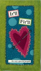


 There are some goofy shadows and shade gradations in these photos. Sorry! I think those are shadows of me, taking the pictures. In real life, these pieces of art are perfect - no strange color inconsistencies.
A short while ago I wrote about the name It'll Fit'll - what it means, why I think it works for this initiative, that sort of thing. What I didn't write was the process of coming to that name. It was a long and thoughtful process. I brainstormed and contemplated and considered and consulted with friends, family, advisors and tweaked and finally settled on It'll Fit'll - the name that seems perfect for this business, a reflection of the lightheartedness with which I'd like to live my life, and a rejection of the staid and predictable.
The It'll Fit'll artmark was a different story. It was more the result of knowing and feeling than thinking. I had the feel of what I wanted to convey with the company logo/identifier, but I couldn't create it myself; I'm no designer or artist. I wasn't sure I could communicate it to a designer, either. Then, I attended the One of a Kind Show in Chicago in December of 2006, wandered into the booth of fiber artist Susan M. Hinckley, and knew that I'd found the person who could develop the perfect It'll Fit'll artmark - if only she'd agree.
I love the whimsy and humor of Susan's pieces. Beyond that, the work is beautiful. Each piece is 100% handstitched and includes fascinating embellishments - beads, rick rack, tiny background stitches. Studying the stitches in her pieces is as interesting to me as studying the brushwork of a master painting. Further, the framing is ideal for these detailed pieces: double mattes of white surround the piece, which is mounted on a matte in the same white. The wood frames are handpainted by Susan. The frame of the It'll Fit'll artmark is painted in a checkerboard of alternating shades of blue. The other two frames are adorned with circles.
To provide a glimpse into the humor of Susan's work, I've posted photos of the two pieces that I bought. When I happened upon Susan's booth and studied each piece, I knew I had to have one of those fun pieces in my home - but which one? That was the challenge. I ended up buying "Be Merry 2" - the one that reads "drink" and presents the woman with the coffee cup head and cup handle arm. She was accompanied by a piece called "Be Merry 1" - that said "eat"- and featured a woman whose head held a colorful meal that I remember as salad. I enjoy coffee to the extent that I'm often teased about it, so the "drink" piece resonated with me. Plus, the colors of the piece blend perfectly with my yellow kitchen. So, I bought that one. I'd really have liked the complementary "eat" piece too, but I've got a business to fund and couldn't justify that purchase.
Nevertheless, I couldn't stop thinking about the piece titled "Unpenned". Susan had found, and bought, 3 old word flash cards at an antique shop. The words on them were "squeal", "zoom", and "glee". They inspired 3 new pieces, each piece incorporated one of the flash cards. My piece - "Unpenned" - incorporates the word "squeal" and pictures a woman joyously riding a winged flying pig through the air and exclaiming "wheeee". The "zoom" card was used in a piece of a dog driving a sports car. The "glee" card inspired a piece named "Happy Thoughts" of a cat with a bird on its head, singing a song.
I love the message of possibility in "Unpenned" and the little details - the 3-dimensional curly tail, the gossamer wing of the pig, the floppy pig's ear, the tiny little silver bead/buckle on the woman's shoe. Also, I've been known to use the term "when pigs fly" and also to squeal sounds like "wheeeeee" and "yeeee haaaaaaaa" when I'm flying my minivan - my kids aboard - down our empty rural roads. So, I had to have that piece too. Luckily it was still available after the One of a Kind Show. Now it's hanging in my living room and I smile every time I look up at it, as I'm doing now while I write this entry.
Anyway, back to the It'll Fit'll artmark....given the humor and warmth and uniqueness of Susan's work, and the fact that her medium is textiles, I knew immediately that she could create a piece of art that would serve as the visual representation of the company's identity. I recently read a great book called Extraordinary Knowing about the "power of awareness to transcend the limits of the linear mind." Gut feelings, hunches, intuition; I believe that they can be predictors and I think some people are just more attuned to them than others are. Just as the idea of this business came to me nearly fully formed, so did the understanding at the One of a Kind Show that Susan would create an ideal, timeless, piece of art that would represent the business perfectly. I explained the idea of the business to her and asked if she would create the piece. To my delight, she agreed. We discussed the piece in the most general terms and I described the one element that I wanted to be included in the design.
When I packed brown bag lunches for my children, I wrote notes on the napkin. I'd also draw a topical picture on the napkin....animals for a zoo field trip, an open book for the day of the Battle of the Books Tournament, a drawing of Lincoln or Washington around Presidents' Day, etc. On days when nothing notable was going on, I'd resort to my fall-back drawing: a ruffled heart with a piercing arrow. So, I asked Susan to include that heart in the artmark; it's a familiar expression of love for my children and so an ideal representation of this newest labor of love. I also explained to Susan that the piece would be the clothing hang tag, so it shouldn't be either overtly feminine or masculine since our customers will be both genders. I told her the company name, the tag line, and our font - Garamond. That was it. She took it from there and created the ideal artmark.
The It'll Fit'll artmark is a little piece of art, created from fabric and featuring a heart and telling our story in a few simple words. It is the centerpiece of our business card, our stationary, our clothing tag, our commercial web site. And that's perfect because it represents the heart that Susie and I are putting into this company and into the clothes that we'll produce, each of which will be like functional works of art to us and, hopefully to you as well.
Susan can be contacted via email at susanmhinckley@smallworksinwool.net


No comments:
Post a Comment